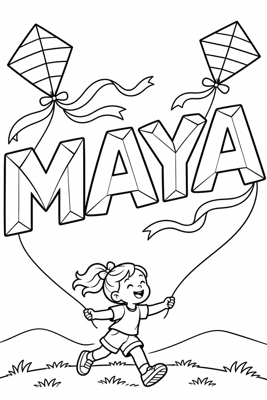
글자
안쪽으로 감기는 Round the Bend
영어 프롬프트 전체를 바탕으로 그리고 싶은 내용을 바꿔 보세요.

원본 프롬프트
Text: ROUND THE BEND Subject: Draw one original square exhibition-quality typographic coloring print. Invent pliant hand-drawn hollow capitals that visibly stretch, lean and fold into their neighbors. Give the letters smooth curving blades, very open faces, dynamic changes in their width, and a clean strong silhouette. The typography forms the whole picture, including every visible fold. White paper and clean black contour lines. Layout: Use one single continuous inward spiral shaped by letters. Begin the first word very big from the outside left. Flow over the top and right, taper down and sweep around the bottom as the second word turns along the same path. The last word winds inside the large first curl and aims toward the middle, narrowing dramatically as each letter gets closer to the center. Place individual letters along the changing curve instead of leaving a detached title in the middle. Let a couple of letter terminals extend into the shape of the neighboring letters, as if hand cut from one paper band. The artistic tension is between the very wide outer white faces and the little opening where the lettering turns into the center. Curved letter contours should make this different from a plain font curved around a circle. Keep the words legible when turning the page. Details: Black outline drawing, no shading or color, very few shaping lines inside letters, broad spaces to color, moderate even whitespace outside the composition. No separate ribbon laid behind the text, extra elements, drawn spiral lines, unrelated ornament, circles of text, captions or text beyond precisely ROUND THE BEND.
프롬프트 편집