文字
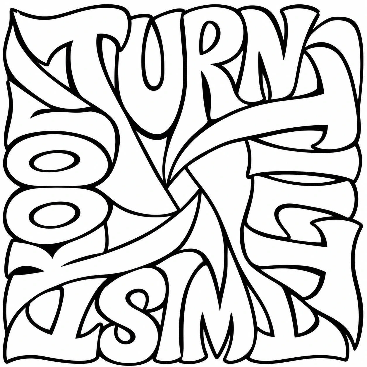
四方向に組んだ Turn, Tilt, Twist, Look
英語のプロンプト全文をもとに、描きたいものに合わせて書き換えられます。
元のプロンプト
Use case: stylized-concept. Create one original high-end hand-lettered typographic print for a coloring page, square composition, black ink contours and only white paper. The exact four words are "TURN TILT TWIST LOOK". Artwork made solely of custom letterforms and the negative space between them. Make an optically compelling tightly interlocked four-way pinwheel, as though a typographer hand-cut and turned the faces of these four words around a small asymmetric white diamond. At the upper edge TURN is upright, very big and playful. At the right TILT rotates 90 degrees as one readable word, wrapping around a corner. At the bottom TWIST rotates 180 degrees as a unit, and at the left LOOK rotates 270 degrees as a unit. Every word becomes easy to read when you physically turn the sheet. Shape the letters specifically to hook and fit near their neighbors at three corners like puzzle pieces with white channels. The T and L stems curve toward neighbors, opening into wedges and broad folded-paper side faces, long terminals respond to the curves of nearby letters, counters are large and irregular. Play with large scale variation and slanted baselines. The individual glyphs should look carved and designed, not generic outlines on a flat ring or four plain labels around a large white square. Use expressive broad hollow shapes and harmonious ink-line rhythm. Rich sculptural contours, no gray, shadows, illustrations, patterns, icons, frame, arrows, extra words or punctuation. Leave a small reliable print margin on all sides. Keep every letter of all four words exact and distinctly readable, including both O letters in LOOK.
プロンプトを編集